Download our official brand resources and learn about
usage guidelines.
Forest Interactive Logo
Download Full Color Logo
Download White-out Logo
Download Black Mono Logo
Using The Forest Interactive Logo
Safe Space
The logo must stand out clearly from its surroundings.
This applies not only to the background but also to items near the logo (text, photographs and other graphic elements) that might compromise the impact of the logo. It is important to keep the logo clear of any other graphic elements.
To ensure this, an exclusion zone or ‘clear space’ rule has been established using the F icon. This exclusion zone indicates the closest any other graphic message can be positioned in relation to the marque. The example demonstrates the minimum clear space required which is the height of the F icon from the logo.
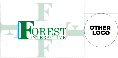
Clear space rule applied to the Forest Interactive logo without a strapline
Minimum Size
The minimum size for all printed material is 15mm wide and 85 pixels (at 72dpi) for digital on-screen use. The logo should never be used less than this size as this would lead to a compromise in readability.
For large formats such as banners, billboards and signages, the logo should be proportionally balanced to the size of the document. In all cases, the logo should never :
-Bleed off any edge
-Be cropped in any way
The logo must always maintain clear space around it especially for large formats such as those stated above here. This will preserve the integrity of the logo and allow for maximum readability.
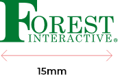
Minimum size for print applications
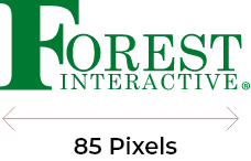
Minimum size for screen use: 85 pixels wide at 72 dpi
Improper Usage
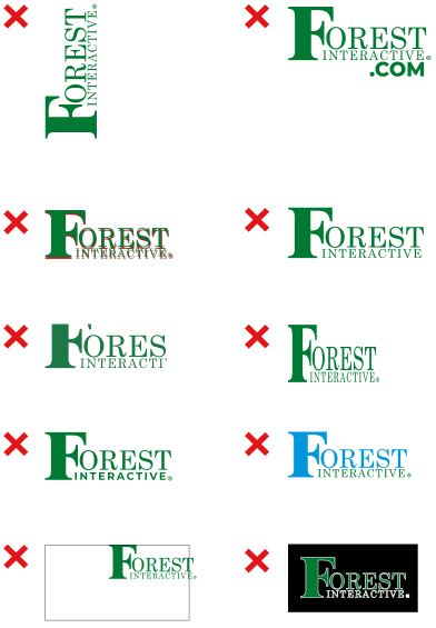
The logo must not be altered or changed in any way and guidelines should always be adhered to. The master logo templates should always be used when putting together collateral.
Don’ts
- Do not rotate the logo
- Do not any texts on the logo
- Do not stretch or wrap the logo
- Do not apply fancy effects to the logo
- Do not be cropped in anyway
- Do not bleed off any edge
- Do not add any color outline
- Do not replicate the type in a different typeface
- Do not change the color of any of the logo elements
- Do not use logo without trademark ®
Minimum size for print applications
Using logo in backgrounds
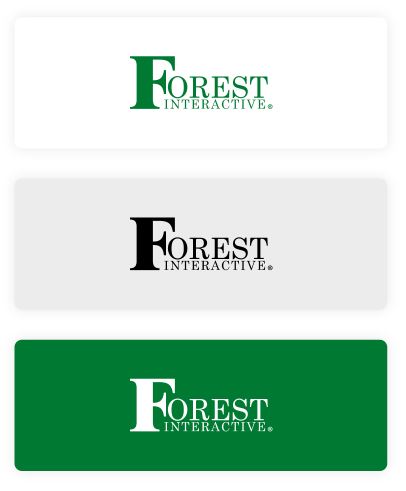
Full Color Logo
The positive version of the logo is always used on clear white or lighter color tinted backgrounds to maintain readability.
Black Mono Logo
For use on facsimile and other black and white publications.
White-Out Logo
When used on dark colored backgrounds, the logo should be all white to maintain readability. This will provide a striking contrast allowing the logo to be clearly legible.
Color
Color is an engaging and vibrant way to display a brand’s character and is an integral part of the identity.
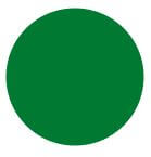
Forest Green
Hex: #007a33
RGB: 0,122,51
CMYK: 100,0,58,52
Pantone: 356C
